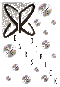

The year was 1970...
we'd been to the moon, Woodstock was a fading
memory and a hit movie, and Richard Nixon was President of the USA. In the halls
of Sears, Roebuck and company, the trademarked word 'Silvertone' was about to
bow out as a Sears 'brand.' After being emblazoned on what seemed to be a
million products since 1916, Silvertone was soon to be no more. The most
immediate evidence of this could be found in the musical instrument area,
Division 57. From the Fall/Winter catalog of 1969, when the familiar cursive
logo was inscribed across nearly the entire line of guitars and amplifiers, to
the Spring/Summer catalog of 1970, when a curious circular emblem appeared...
sometimes on a silvery disc, sometimes a simple silkscreen, sometimes bare,
without any accompanying circle... I've come to call it the 'Space Dot,'
and it was actually seen on many other electronic products from Sears dating
back to the very late 1950s.
I
frequently refer to the stylized logo that was applied to the
later era Sears guitars and amps as the 'Space Dot.' From a distance, it looks
like a futuristic atomic space-age doohickey... but up close, it's a couple of
discs set perpendicular to one another, viewed at an angle, with an axis
protruding slightly from what would be one of the devices poles. Nice, but
nothing earthshaking, right?
One day, an astute Silvertonian mentioned to me that the logo was actually a
stylized 'S' and 'R' representing, of course, Sears and Roebuck. I'd looked at
that logo a thousand times, I even have some products with it on them, and it
never
hit me.
Stroke of genius, design-wise... now that I can see it.

